A film poster is more than just a marketing tool. It’s an artistic representation of a film’s themes, atmosphere, and story, all condensed into a single image that should instantly grab the viewer’s attention. Creating a striking poster is a vital part of any film’s promotional strategy. In this article, we’ll explore what makes a great film poster, analyze iconic posters from Jaws, The Dark Knight, and Spider-Man: Into the Spider-Verse, and offer insights into key design elements such as billing blocks, typography, and composition. Whether you’re creating a poster for your own indie project or analyzing big-budget designs, understanding the following principles will help you design a visually compelling and effective film poster.
What is a Film Poster?
A film poster is essentially a promotional image that encapsulates the essence of a movie. Designed to attract potential viewers, the film poster serves as a window into the movie’s world, offering a glimpse into its plot, tone, and visual style. The poster acts as a bridge between the film’s content and the audience, drawing attention and generating interest.
In terms of design, film posters typically feature the movie’s title, tagline, credits, and visuals that symbolize key elements of the film. They may also include actors, the production company, and a release date. Historically, posters were printed and displayed in cinemas and public spaces, but today, digital posters are widely used across social media platforms, online streaming services, and advertising.
What sets a film poster apart from other marketing materials is its ability to combine creative artistry with commercial purpose. A well-executed poster can become an iconic piece of art, recognized and admired for years after a film’s release. A successful poster does not just promote a movie; it conveys its mood, genre, and story, offering potential viewers a taste of what they can expect when they enter the theater.
The Benefits of a Film Poster
Branding and Identity
A film poster is often the first touchpoint audiences have with a movie. Its design plays a pivotal role in establishing the visual branding of the film. Everything from color choices to the imagery used in the poster should align with the film’s themes, tone, and aesthetic. For example, a poster for a horror film will have a very different visual language than one for a romantic comedy or an action thriller. This branding helps define a movie’s identity in a crowded marketplace and allows audiences to instantly recognize the genre or feel of the film.
Audience Engagement
A well-crafted poster has the ability to evoke emotions, provoke thought, and create curiosity. In a world of constant media bombardment, capturing a viewer’s attention in a split second is crucial. The film poster must spark interest and encourage viewers to learn more. Whether it’s through stunning visuals, an intriguing tagline, or an eye-catching design, the goal is to create a sense of urgency that compels viewers to click, learn more, or attend a screening.
Marketing Tool
Film posters are an essential part of a movie’s promotional campaign, often playing a role in the movie’s marketing strategy even before the official trailer is released. They are displayed on buses, trains, billboards, and theaters, and increasingly across digital platforms like social media, where visually striking images are likely to be shared and spread. The poster functions as a public statement about the film’s release, creating buzz and establishing awareness about its impending debut.
Visual Storytelling
A film poster isn’t just a static image; it’s an opportunity to tell a story. Through composition, color, typography, and imagery, the poster can convey the central conflict, themes, or atmosphere of the film. For instance, a poster for a war drama might feature powerful, gritty imagery with a muted color palette, while a romantic film might use softer, warmer tones to suggest intimacy. The poster should immediately tell the viewer what kind of experience they can expect—whether it’s action-packed, heart-wrenching, or mysterious.
Analyzing Iconic Film Posters
To better understand what makes a film poster stand out, let’s look at three iconic examples: Jaws (1975), The Dark Knight (2008), and Spider-Man: Into the Spider-Verse (2018). Each of these posters has been successful at not just promoting their films but also capturing the essence of their narratives in a visually compelling way.

Jaws (1975)
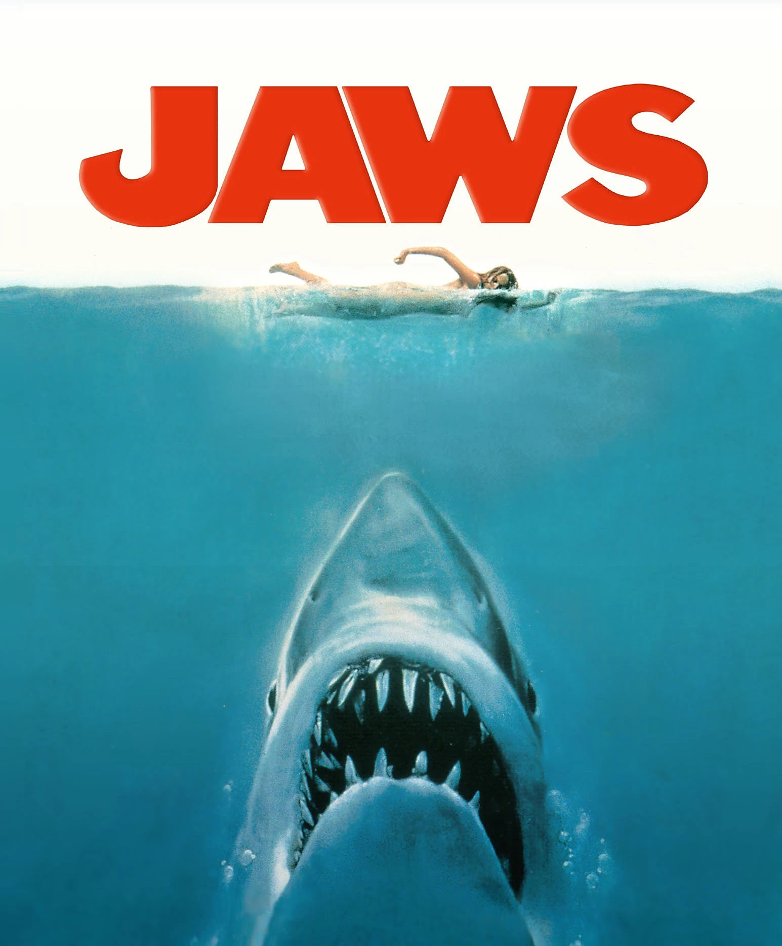
The poster for Jaws is a masterclass in simplicity. Directed by Steven Spielberg, Jaws became a cultural phenomenon, and its poster plays a crucial role in its success. The image of a massive shark emerging from the deep ocean, jaws wide open, with a lone swimmer completely unaware of the danger, is one of the most iconic film images of all time.
Key Features
Color Palette: The use of blue and white dominates the design, immediately suggesting water, danger, and the natural world. The dark blue color evokes the deep, vast ocean, while the stark white of the shark’s teeth stands out sharply. The red title at the bottom, almost like a warning, introduces an element of danger and urgency that heightens the tension.
Imagery: The central image of the giant shark looming over the swimmer is immediately terrifying. It’s a classic representation of suspense and impending doom. The viewer is drawn into this moment of suspense, with the swimmer blissfully unaware of the danger beneath the surface.
Tagline: The tagline, “Don’t Go in the Water,” is simple but effective. It heightens the anxiety created by the shark’s presence in the poster. It invites the viewer into the narrative by suggesting they will experience the kind of fear the swimmer will soon encounter.
Why It Works: The Jaws poster succeeds because it is minimalist and focused, yet powerful. The large shark’s dominance conveys the threat while keeping the poster clean and simple. The tension in the design is palpable, and it makes the viewer want to learn more about the film and its terrifying premise.

The Dark Knight (2008)
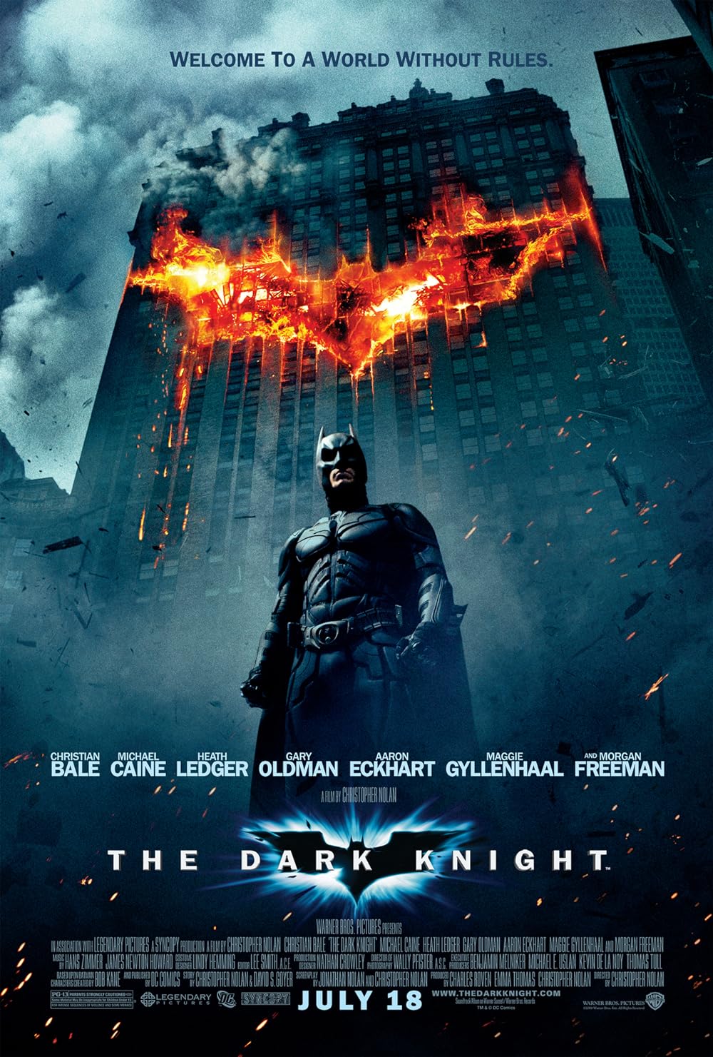
The poster for The Dark Knight, directed by Christopher Nolan, features a striking image of the Joker, played by Heath Ledger, whose chaotic and menacing demeanor captures the essence of the film’s antagonist. This poster’s intensity and stark imagery help set the tone for the dark, psychological narrative of the film.
Key Features
Focus on the Villain: The central image of the Joker’s unsettling smile and wild eyes immediately establishes him as the main focus. His chaotic nature is conveyed through the distorted facial expression, making the viewer instantly uneasy.
Typography: The title “The Dark Knight” is set in bold, simple typography that contrasts with the chaos in the image. The title’s strong presence adds to the feeling of seriousness and gravity.
Color Scheme: The use of dark tones, primarily black, sets the gritty and ominous atmosphere. The deep shadows on the Joker’s face, coupled with the subtle green and purple hues, underscore his anarchic and dangerous personality. The bright yellow title, though starkly contrasting, gives a sense of power and urgency.
Why It Works: This poster’s focus on the Joker establishes the film’s central conflict and perfectly mirrors the movie’s dark, tense atmosphere. It’s unsettling yet captivating, and its simplicity in design ensures it stands out without being cluttered.

Spider-Man: Into the Spider-Verse (2018)
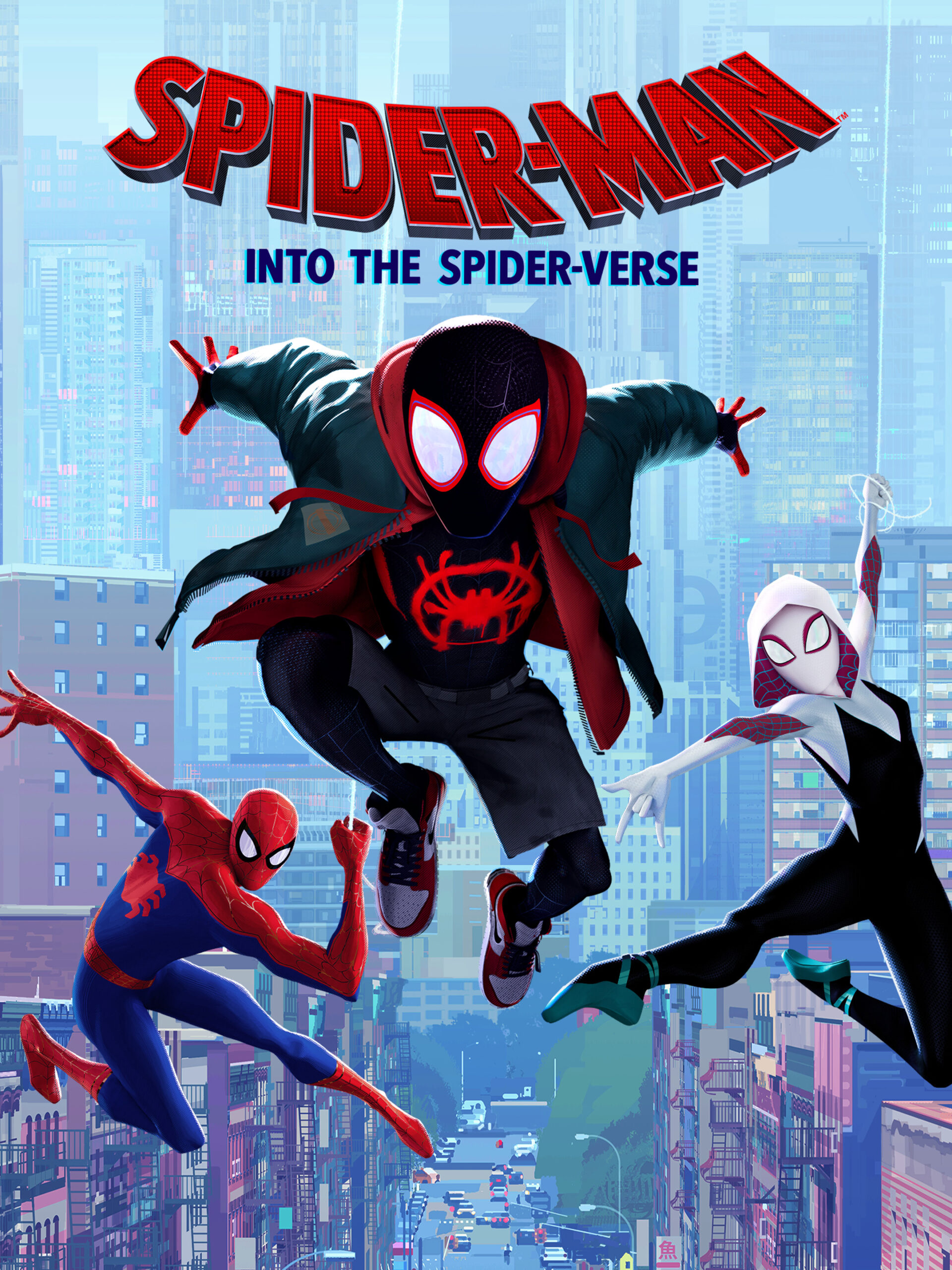
Spider-Man: Into the Spider-Verse presents a visually stunning, comic book-inspired poster that captures the vibrant energy and unique visual style of the film. It not only showcases the multiverse concept central to the story but also stands out as an artistic and bold piece of design.
Key Features
Vivid Colors and Energy: The poster uses bold, eye-popping colors—bright reds, blues, yellows, and purples—to create an energetic composition. The vibrant hues make the poster feel dynamic and alive, which perfectly matches the fast-paced, action-filled nature of the film.
Character Diversity: The poster highlights multiple versions of Spider-Man, symbolizing the multiverse concept. This instantly tells viewers that the movie will offer something new and different from previous Spider-Man films.
Comic Book Influence: The halftone dots and bold, stylized outlines evoke the aesthetic of a comic book, which is integral to the film’s unique visual style. This homage to the source material adds depth and texture to the design.
Why It Works: The Spider-Man: Into the Spider-Verse poster is eye-catching because of its vibrant, lively design and its clear communication of the film’s innovative animation style. The use of color and character diversity conveys the film’s playful yet adventurous tone, and its bold composition ensures the viewer’s attention is immediately captured.
Billing Blocks
A billing block is the section typically found at the bottom of a film poster, containing important credits, including the names of key actors, the director, the production company, and other essential contributors. This section is an important part of film poster design, as it ensures that industry professionals and the people responsible for making the movie are acknowledged.
In addition to credits, the billing block often includes other information such as the film’s release date, trademarks, legal notices, and sometimes social media handles. While billing blocks may seem secondary to the main visual elements of the poster, they are an essential component for those looking to understand the film’s production details. A well-organized and legible billing block adds professionalism to the poster and ensures that the film complies with industry standards.
Typography and Font Choices
Typography is one of the most important design elements in a film poster, as it not only helps convey information but also reinforces the movie’s tone and genre. The typeface used for the film’s title, tagline, and any other text on the poster should be carefully selected to match the film’s theme and emotional impact.
The Importance of Typeface Selection: The choice of font sets the stage for the viewer’s emotional experience. For example, a horror movie might use jagged, sharp fonts to create tension and fear, while a romantic drama might use smooth, elegant typefaces to evoke warmth and intimacy. A well-chosen font should be readable, but also expressive enough to give insight into the film’s mood. The font can reinforce the message of the movie without needing to say anything at all.
Size and Hierarchy: In most film posters, the title of the film is the largest text element and should be the most prominent. However, the use of hierarchy within typography ensures the viewer knows exactly where to look first. Taglines, actor names, and credits typically follow in decreasing size, with the billing block often taking up a smaller area at the bottom. Ensuring proper visual hierarchy is essential for guiding the viewer’s eye naturally from one element to the next.
Complementing the Visuals: Typography should complement, not compete with, the poster’s visuals. The font’s style, color, and weight should harmonize with the images, ensuring that both text and image work together to form a cohesive design. A good example is the use of bold, blocky fonts in action films, which resonate with the dynamic visuals and high-energy storytelling, while delicate serif fonts in romantic films can evoke elegance and softness.
Composition and Layout
Composition refers to the way elements in the poster are arranged. It is critical to ensure that the poster’s design guides the viewer’s eye in the most effective way, leading them through the most important parts of the poster—be it the title, the key image, or the tagline. Good composition can transform a basic image into an intriguing visual experience.
Balance and Symmetry: Whether the poster is symmetrical or asymmetrical, the balance between text, imagery, and negative space (empty space around the design) is crucial. Symmetry creates harmony and order, which can be ideal for genres like historical dramas or family films. In contrast, asymmetry can evoke a sense of dynamic energy and movement, which is often seen in posters for thrillers or action films. The use of balance ensures that the poster does not appear cluttered or overwhelming but still guides the viewer’s gaze naturally.
Focal Point: Every poster needs a focal point—a specific element that stands out and captures the viewer’s attention. This could be an image of the protagonist, the antagonist, or a key scene from the film. By placing the focal point in the right place and ensuring it contrasts well with the surrounding elements, the designer can create a visual hierarchy that directs the viewer’s focus exactly where it’s needed.
Negative Space: Negative space refers to the areas of the poster that remain unoccupied by images or text. Far from being “empty,” negative space is a crucial tool in design, allowing the main visual elements to stand out more effectively. Too much clutter can overwhelm the viewer, but well-utilized negative space helps the design breathe, creating a more engaging and less chaotic layout.
Using Visual Hierarchy
Visual hierarchy refers to the arrangement of elements in a way that naturally guides the viewer’s attention in a specific order. This concept is particularly important when it comes to film posters, as it ensures that the most important elements, like the film title and main imagery, capture the viewer’s attention first.
The Title’s Prominence: The film’s title is usually the first thing a viewer notices. Its size and placement are vital for ensuring it is not overlooked. Typically, the title is positioned in a prominent location (often near the top or center) and set in the largest typeface. This ensures the viewer immediately associates the image with the film.
Supporting Elements: After the title, other text elements like the tagline, actors’ names, and credits should follow in decreasing order of importance. Taglines often serve as a secondary hook, offering a glimpse into the film’s theme or central conflict. By using different font sizes and weights, designers can establish a clear visual hierarchy, which improves the legibility and overall effectiveness of the poster.
Using Lines and Shapes: Lines, borders, and shapes can also be used to direct attention and create emphasis on certain aspects of the design. For instance, diagonal lines can create movement and energy, while straight, horizontal lines can suggest stability and order. Using these design principles creatively can enhance the flow of information and help the viewer’s eyes move through the poster in a structured manner.
Conclusion
Creating an eye-catching film poster involves much more than simply choosing a striking image. It requires a deep understanding of design principles, from composition to typography, to the psychology of color. A successful poster not only grabs attention but also conveys the essence of the film, building excitement and curiosity in the audience. By analyzing iconic posters like Jaws, The Dark Knight, and Spider-Man: Into the Spider-Verse, we can learn valuable lessons about the power of visual storytelling and design.
The key to a great film poster is balance. Whether it’s a minimalist design like Jaws or a vibrant, energetic composition like Spider-Man: Into the Spider-Verse, every element must work together to tell a story. By focusing on aspects like visual hierarchy, typography, billing blocks, and composition, you can craft a poster that does more than just advertise a movie—it becomes a piece of art that invites audiences into the world you’ve created. Remember, a great poster is not just seen; it’s felt. It’s that initial spark of intrigue that leads viewers into the theater, ready to experience the film you’ve worked so hard to bring to life.